Building a Site that Feels Like an App
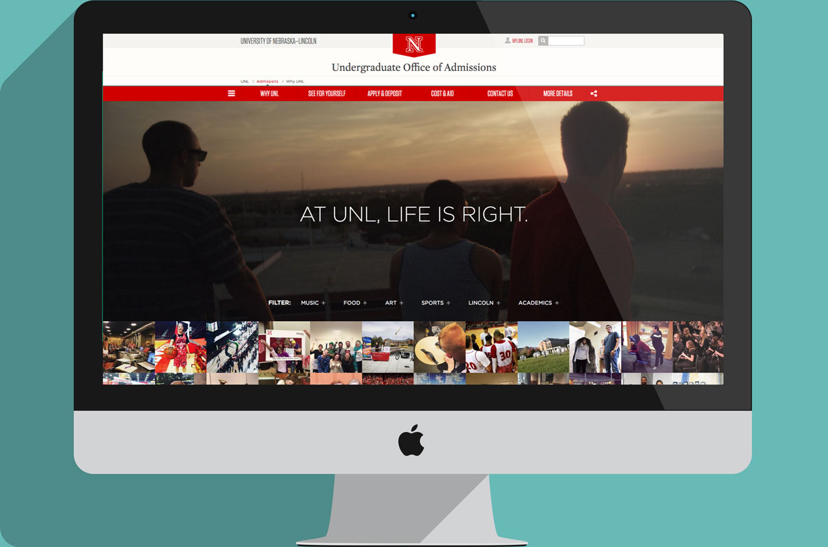
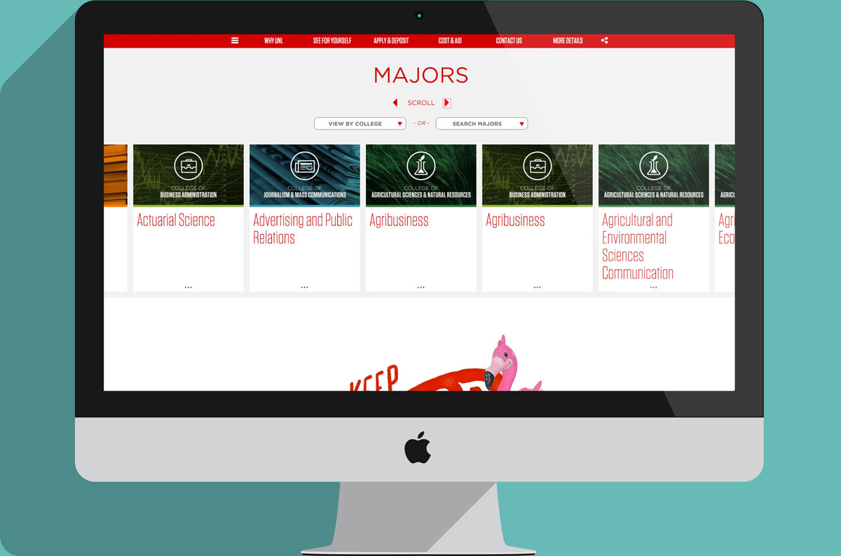
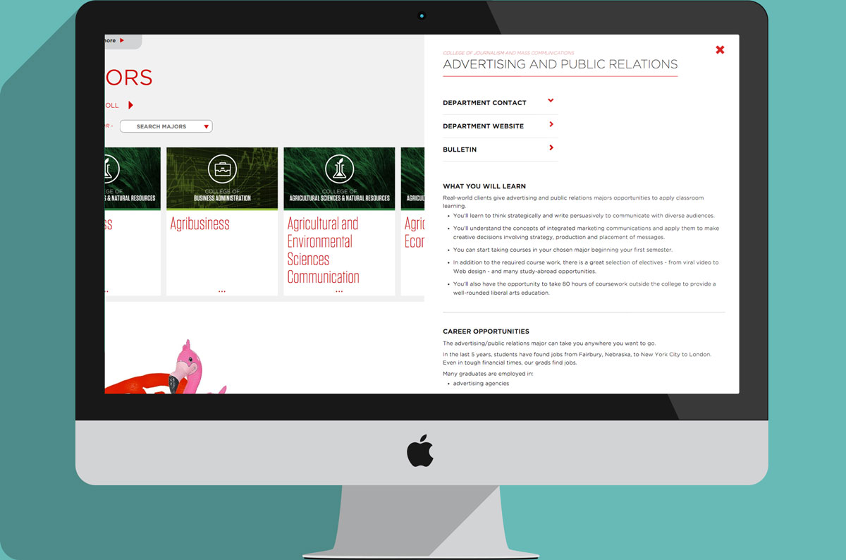
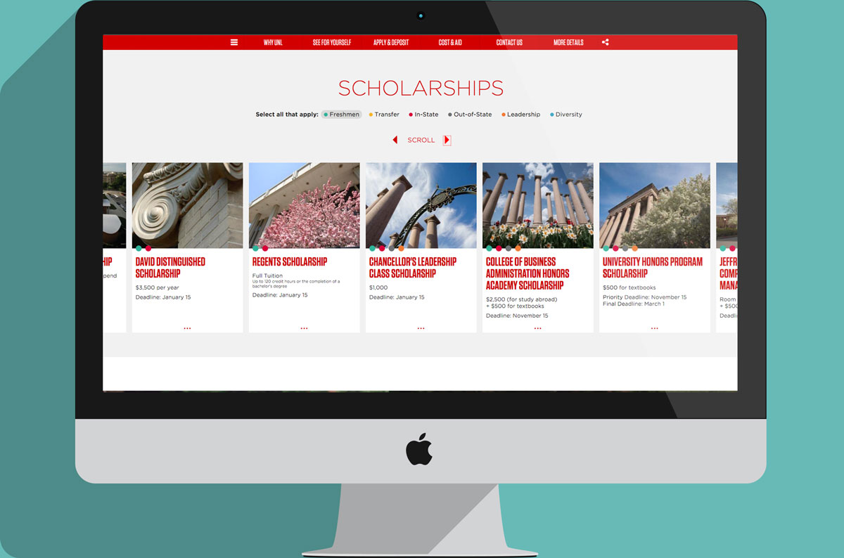
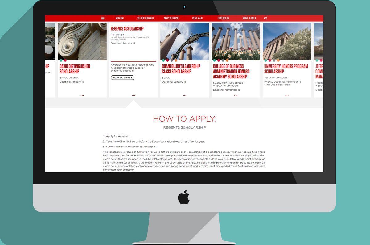
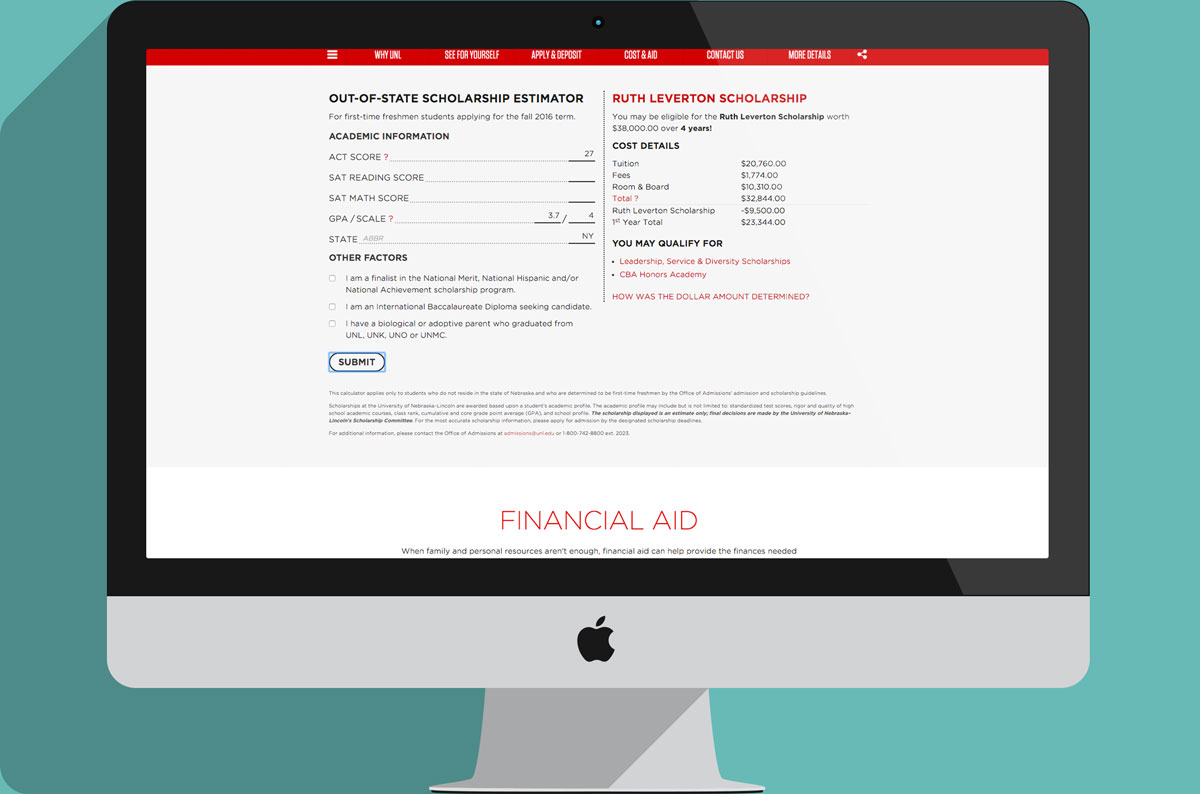
The web of pages is quickly being replaced by a web full of cards—because cards are the design pattern for mobile devices. To make our site feel more like an app, we focused on interactions that would keep users on the page rather than take them down a never-ending path of breadcrumbs.
In total, we reduced the number of pages from over 400 to about 30 and drastically improved a user's aesthetic experience. This is huge, especially for mobile users, of which we have over 50% more YoY (the site is fully responsive, but the fullscreen screenshots are just easier to demonstrate, and dare I say, a bit sexier). Since launching, we've increased traffic 51% and our daily active user rate has doubled.
There's also a share more fun content on the site...like an Instagram feed, Tumblr features, and a "Keep College Weird Section."
Disclaimers
- Since websites change all the time, I've included screenshots below to help illustrate what the project looked like during my involvement with it. At your own risk, click to visit the UNL Admissions website for a live version.
- As the "Project Details" section clearly states, my role in our web project was creative direction. I was honored to lead a team of really talented copywriters, designers, and developers to pull it off. You can see my team members here.